On Friday, April 7, I was in love, Shakira’s new single. Global joy: it is the advance of his awaited new album (the previous one came out in 2014). His lyrics evokes the beginning of his relationship with Piqué, so his repercussion is transcending the musical. Even in the Hello have dedicated a few lines. But his rapturous verses are not the only thing being discussed with fervor. Also his indescribable cover.
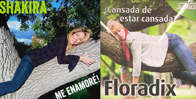
The photo shows a radiant Shakira, perched on a tree and hugging a thick branch. No matter how much you examine it, there is nothing in the image that matches the words “glamor” or “artistic.” His posture is more typical of someone who hugs a horse, only without a horse. As for the location, it is not the punished Madrid Country House …, but it seems. By design, there are more cursed memes. At his side the covers of Belter Records deserved an exhibition in the MOMA.
“This song tells a moment in my life where I was so in love that I was literally climbing trees,” Shakira commented on this homemade snapshot taken in 2010. Although it is true that in the age of digital downloads the importance of a cover is relative – the times of artworks of 30 cm x 30 cm were left behind -, it is possible to ask if a homemade photo, in crude and intricate design, is valid as a showcase of a song. In order to know if this is an “Arrggg” or genius, we have talked with some of the best designers and photographers of album covers in this country.
Sergio Mora: “Recover the style of gas station tapes”
“” A psychologist would surely talk about something related to the big penises. Luckily I’m not a psychologist, “Sergio Mora
The recent winner of a Latin Grammy for the design of The poet Halley, of Love of Lesbian, thinks that “it is so horrible that it turns around and brushes the genius. She’s making us talk about her right now. The truth is that I liked the front covers more, when she appeared dressed as a character of Mad Max, Barbarella or Conan the Barbarian. I seem to regain the style of gas station tapes. ” Since all the covers try to convey a concept, what would be the one behind it? “A psychologist would probably talk about something about big penises. Luckily I am not a psychologist and I dare not venture, so I would make a reading more related to the love of nature, life and the cosmos. ”
Rafa Sañudo: “It is hortera a rage”
Rafa Sañudo has designed more than 400 covers, including some for Alejandro Sanz, Miguel Bosé, Marlango, Los Secretos, Los Piratas and María Jiménez. In 2007 he designed the Madrid metro plan. This professional veteran takes it with humor. “It is closer to being a horror than a genius, but it does not even become so: it is a country clump. And tacky raging. ” Positions to emphasize something, positive or negative, chooses “the size of the branch that embraces the Amazon”. The message she finds in this disconcerting image is this: “I am so happy, full of joy and delighted to have met. Oh, and this photo made me my Piqué. ”
Mario Feal: “It looks like a box of discs to 1 euro”
“If it was published on vinyl, it would look like a 1 euro drawer cover, and the best thing is the coolness of not pretending (or so it seems) or using retro effects”, says Mario Feal, head designer of Subterfuge Records and author from Sexy Sadie covers, The Rebel Fresones, Arizona Baby, Neuman, PLV Havoc, Bravo Fischer! the Aristocats. “The design can not be cheaper (will it?), Just the opposite of the overproduced image that is expected of an international star. To the European eye, cynical and resabiado, it is difficult to believe that all this is not premeditated, hopefully it is not it “.
“I’m so happy, full of joy and delighted to have met. Ah, and this photo made me my Piqué, “Rafa Sañudo
Domingo J. Casas: “How horrible it is”
Legendary portraitist, is the voluminous footer that you see in all the concerts. There is practically no soloist or group of this country (from Rosendo to Plácido Domingo passing through Alejandro Sanz, Revolver, the Dynamic Duo or Los Flechazos) that has not submitted to its incendiary flash. “As a cover is worth any photo that the artist chooses,” he says. “This is not made by a professional, it is a familiar image. She is without make-up and is not taken care of or styling or anything. How horrible it is; as a family memory, has the value it has. For her it must have a special meaning. The daring to put it? It seems to be worth everything. I hope it does not set the example, because if the musicians take their pictures, we cease to exist. ”
Mario Larrode: “I want to think it’s a gift for your fans”
His photos have illustrated covers of Hombres G, Los El